title: "UX and visual bar" sidebar_position: 4
UX and visual bar
Features don't merge unless they meet this bar. Visual quality is not a follow-up task.
Principles
-
Inside the grid, behave like Google Sheets. Assume users know Sheets, not 1-2-3. Typing replaces a cell,
=starts a formula, Enter commits and moves down (back to the starting column after Tabs), Tab moves right, Shift+arrows and the mouse select, Ctrl+arrows jump to the data edge, and Sheets shortcuts do what Sheets does. When Sheets and 1-2-3 disagree, Sheets wins. 1-2-3 lives on as the visual identity: the control panel doubling as the formula bar, the mode indicator, the crisp character grid.Both are the seed and the design pattern, not a spec. Match them where users' habits depend on it (keys, entry, formula syntax and results people rely on); elsewhere do what serves a terminal spreadsheet best, and say so in the docs where 012 differs on purpose. "Sheets does it differently" is a reason to look, not a bug by itself.
-
Familiar, but native to the terminal. Sheets tells us which jobs users expect to get done and which keys they reach for, not what the screen must look like. This is a Bubble Tea program: prefer patterns that feel at home in a terminal when they serve the same need as well or better. Bars and prompts on the context line or status line over floating dialogs, incremental search that highlights as you type, toggles shown as key chips, pickers in the style of fzf or lazygit, and no fake GUI chrome (drop shadows, faux buttons) unless it earns its place. Overlays are fine when content genuinely needs room (menus, long lists), and they stay keyboard-first.
-
Everything is discoverable. Every action is a registered command (
internal/) with a title and one-line description. It is reachable from the menu where Sheets would put it, from key bindings inui/ commands.go keymap, and from help (generated from the registry). The command palette lists every registered command with its keys. -
The screen always says what's going on. The mode indicator is always correct. The control panel is the menu bar (with the mode indicator), the formula bar, and the context line, which holds prompts, small confirmations and the keys that apply in any non-READY state. While a menu, the palette or the shortcuts are open, the status line says what the highlighted item does and which keys apply.
-
Never lose work. Destructive actions warn when there are unsaved changes and are undoable once undo exists. Errors are specific ("expected , or )" with the cursor on the spot), never generic.
-
Esc backs out one level; Enter confirms. Everywhere, no exceptions.
Visual rules
The palette over a sheet shows most of them at once: bars that fill the width, an overlay framed in light lines with its title in the top border and a count in the bottom one, keys drawn as chips, and the status line saying what the highlighted item does.
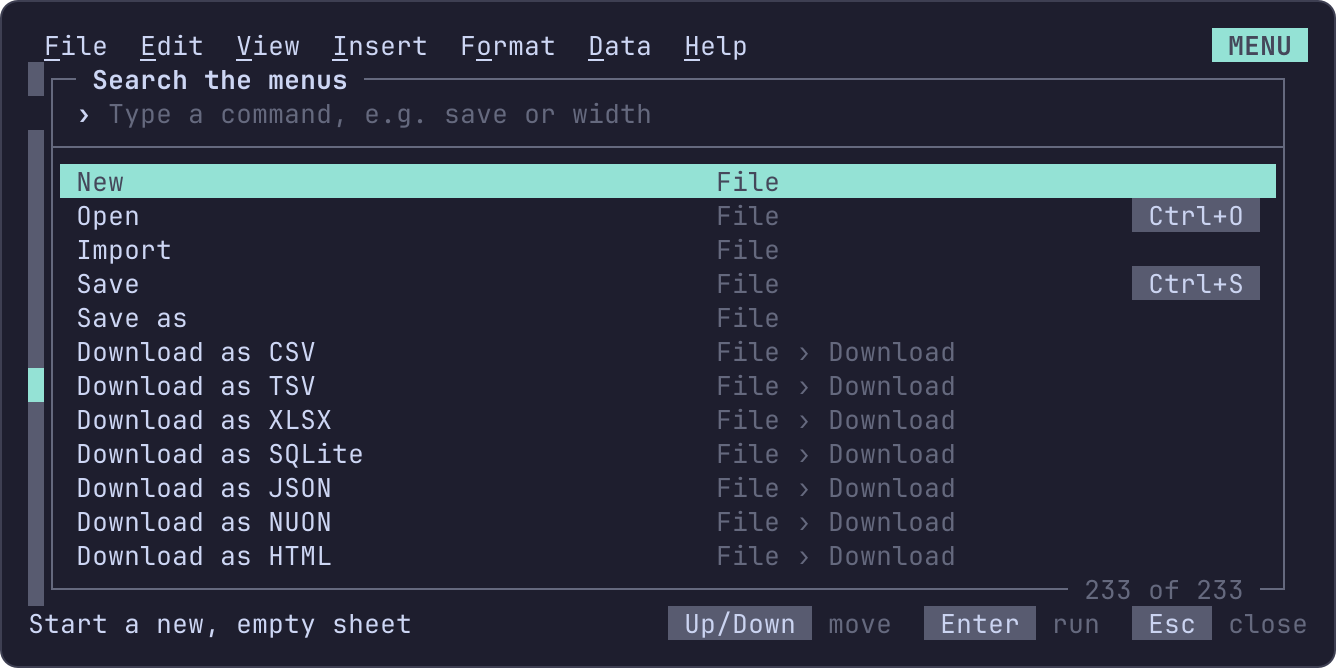
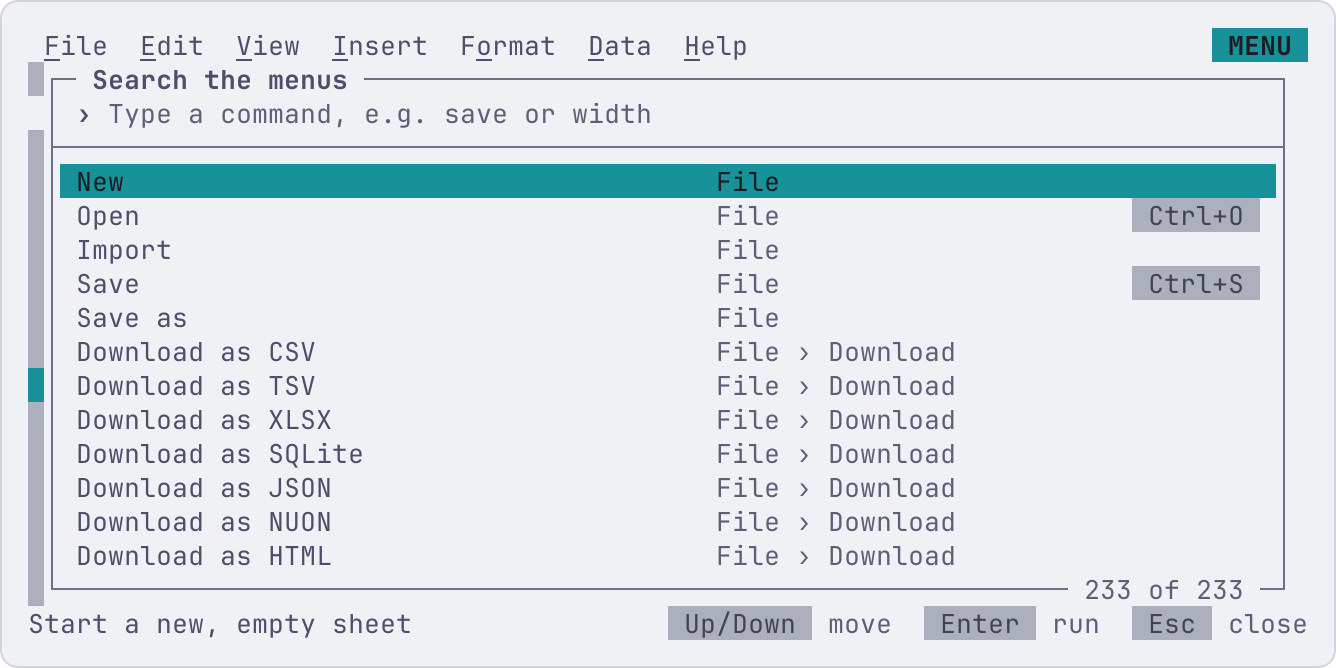
- Style only through
themeroles (internal/). No inlineui/ theme lipgloss.NewStyle()in views. Need a new role? Add it tothemewith a comment saying what it's for, in both the dark and light variants. - Use the 16 ANSI colors so the user's terminal palette applies. No
hard-coded RGB. Color schemes (Themes) are data: they
map the same roles to their colors and correct contrast, and
TestEveryThemeReadablemust pass for a new role. - Bars (menu bar, formula bar, context line, column headers, status line)
get their background from their row role and must fill the full width,
at odd widths and under overlays; draw them with
theme.Fill. - Text on a colored background needs about 4.5:1 contrast against both
reference palettes (
e2e/). Check it in the gallery.palette_test.go - Never rely on color alone: every state also shows as text, a glyph or an attribute, listed in Reading without color.
- Numbers right-aligned, text left, booleans and errors centered, one
column of padding, text overflowing into empty neighbors: as Sheets.
Headers centered. Menu bar titles separated by two spaces. Keys shown
as
F2,Ctrl+Z,Del(seetheme.KeyLabel), drawn as key chips (Theme.Chip) in hints, menus, the palette and the shortcuts. - Menus, the palette and the shortcuts are overlays: boxes framed with
light box-drawing lines (
Theme.Frame), composited over the grid without moving it, with a title in the top border and a position or count in the bottom one. Small questions (quit with unsaved changes) go on the context line as a choice bar, not in a box. - The active cell is always distinct from the rest of a selection, and the headers of selected rows and columns are highlighted.
- Layout works from 60x16 up to very wide terminals. Nothing jumps position between frames; overlays don't shift the grid.
- Render only what's visible. A keystroke on a 10,000-cell sheet must feel instant.
Reading without color
Each state has a cue that survives a terminal without color, or a reader
who can't tell the colors apart. internal/ draws
each with theme.Monochrome (every role in one gray) and checks the cue
is in the cell's text or attributes; a new state gets a cue and a case
there.
| State | Cue without color |
|---|---|
| The pointer (active cell), the selection, their row and column headers | Reverse video; the active cell's headers are also bold, and the name box names the cell or range |
| Errors | The error's text (#DIV/) with a curly underline, explained on the context line |
| Warnings | Text on the context line or status line (Invalid: ..., Circular reference) |
| Entries failing validation | A dotted underline, and Invalid: with the rule on the context line |
| Values an array spilled | Italic, and Spilled from B2 on the context line |
| Linked files' rows, following, paused or failing | Italic; ●, ‖ or ! beside the tab's name and on the context line, with the state in words (Following, Paused, the error) |
| A linked source's tab, its scrollbar, rows on their way | ▦ before the tab's name and on the context line, ! after it when the file can't be read; the scrollbar's thumb ┃ on a track of │; … in place of a row being read |
| A notebook's cells and outputs | Marks and words, listed in Notebooks: the bar left of the active cell, a heavy box while it's edited, the prompt's and the box's words for its state, × before an error, OUTPUT in an output's grid, an output sent to a sheet in italic |
| A table's header row | Bold and underlined, when the table styles its header; Table Sales, column Amount on the context line |
| Pivot table results | Their headings (SUM of Units, Grand Total), and a note in words when an edit is refused |
| Protected ranges | A question in words before an edit (A1:B2 is protected.) |
| Notes | A ▝ in the cell's top-right corner |
| Others in a shared workbook (012 serve) | Their pointer's cell double-underlined, their initial on its row's header, their name on the status line, ▘ in a cell they changed in the last 30 seconds, and Changed by, is here or their warnings in words on the context line |
| Agents in the workbook (live mode) | A ◆ for their initial on the row header and before their name on the status line, agent in Who's here; a ◇ in a cell their suggestion would set, what they suggest in words on the context line, and the count on the status line |
| Macro recording | REC beside the mode indicator |
| Mode | The mode indicator's word (READY, ENTER, POINT, MENU, on a notebook NOTEBOOK, EDIT or OUTPUT, and on a linked source's tab SOURCE) |
| Search matches, traced cells | Reverse video, with a count or the list on the context line; dependents also bold |
| Evaluate formula | The part computed next underlined and bold, values in its place italic, and Next and Value in words |
| The copied range | A dashed underline |
| Dropdowns, checkboxes, active filters | ▾, or a chip in reverse video between ▐ and ▌; [ ] and [✓]; ▼ instead of ▾ |
| Data bars, icon sets | Eighth blocks as long as the number, and reverse video under the text they run beneath; the icon's glyph (↑, ◑, ✓, ▆) |
| Borders (of any color), wrapped text, merged cells, tall rows, vertical alignment | Characters: box-drawing lines, the text's own lines, one value across the merge, the row's number on its last line, the value on the line it's aligned to; the pointer on a merged cell reverses all of it |
The reverse-video roles (Theme.standouts) keep their look in color:
their colors are stored swapped, so SGR 7 swaps them back. Conditional
formats, color scales and border colors are colors the user chose, and stay
colors.
Required with every user-facing change
- [ ] Registered command(s) with title and description; key binding in
keymapif Sheets has one; menu entry where Sheets would have it. - [ ] Unit tests in
internal/drivingui Update, plus engine tests. - [ ] An e2e test in
e2e/for the main flow. - [ ] Golden screen(s) in
e2e/for every new visual state, with ascreenlist_test.go -lightvariant if it introduces new colors. - [ ]
make screens, then look ate2e/(serve it over HTTP and screenshot it, or open it in a browser). Fix anything misaligned, low-contrast, cramped or clipped before committing. Screens are drawn from libghostty's cell grid, so they match what a terminal shows.testdata/ screens/ gallery.html - [ ] The feature's doc updated in place, where a reader looks for it,
and its keys in Keys and mouse (tests check every bound key is
there); a headline feature gets a tape in
demos/and a place in the README (Testing).
Review checklist for screenshots
- Is the mode indicator right? Does line 3 explain the keys?
- Is anything clipped at 60 columns?
- Can every piece of text be read in both palettes?
- Does the new element look like it belongs: same spacing, same roles, same capitalization as the rest?